Foxhollow Farm
Combining two separate websites into one consistent experience.
The Challenge
This project presented a front-end UX challenge. We needed to create a single source for two different order types, pickup and delivery, which had previously been managed on two separate domains.
Through careful UX considerations and intelligent design we were able to make the order type selection clear throughout the product selection and order process. In the end it appears to have worked as we were able to more than double the 2020 combined eCommerce conversion rate for their previous two websites in the period since the consolidated website was launched.
Check out how we did it!
UX Solutions
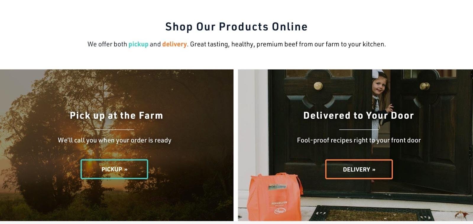
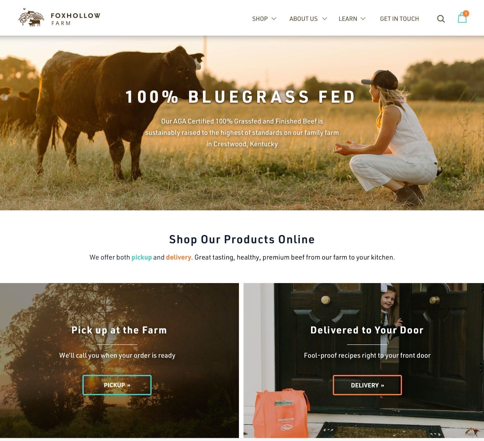
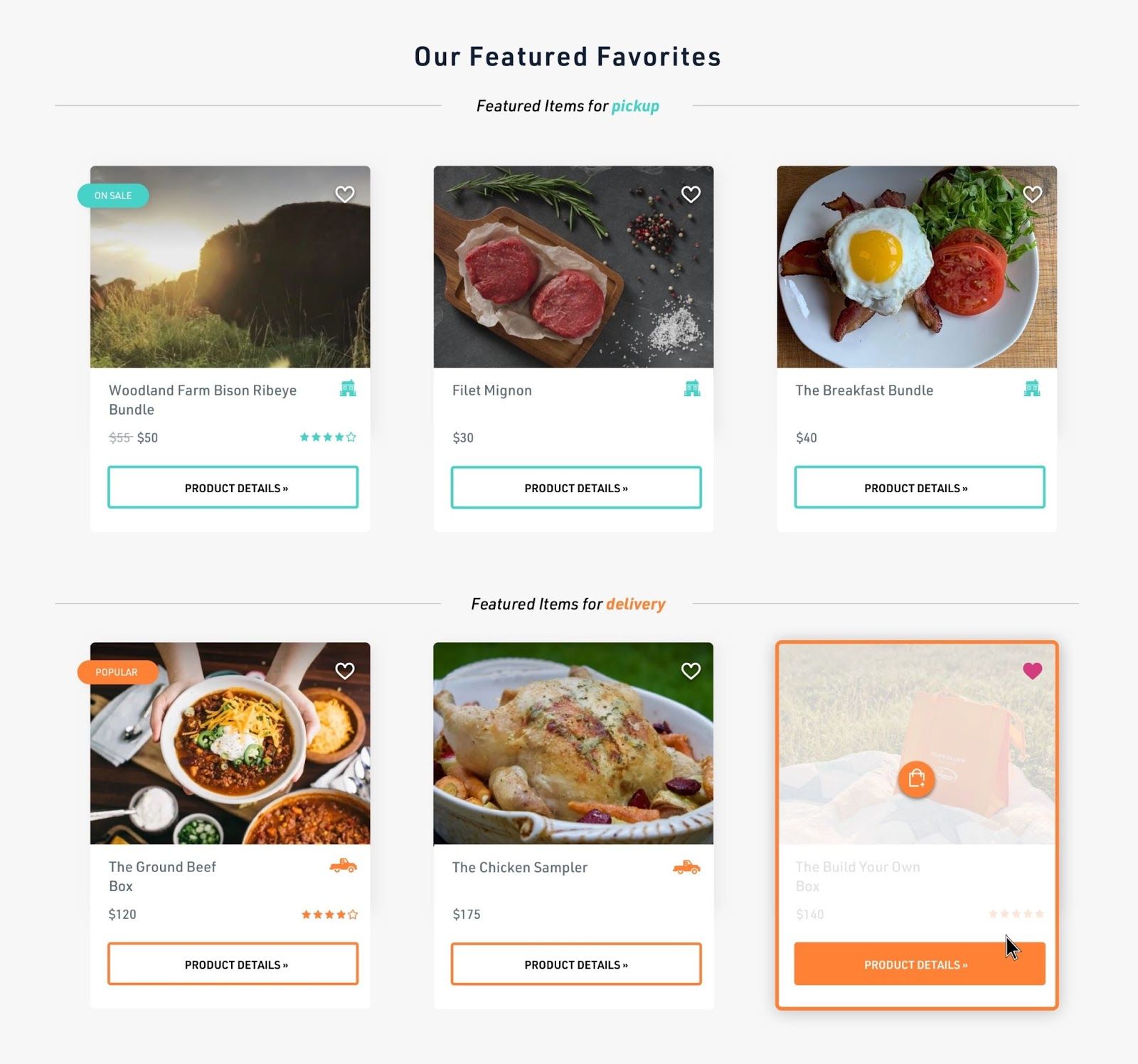
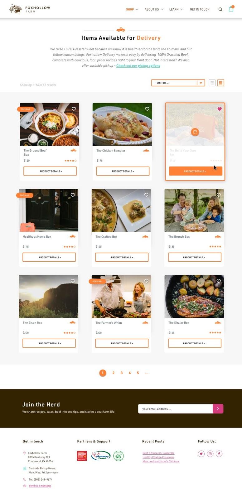
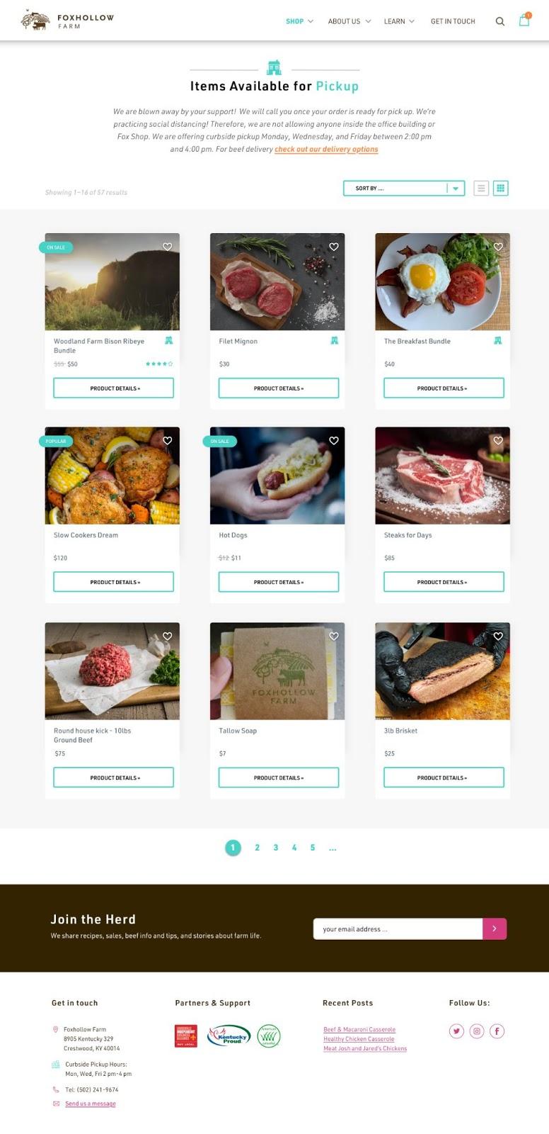
We decided to build a color system to clearly identify the two ordering options - pickup and delivery. Teal would represent items available for pickup at the farm and orange for delivery products. The correlation between color and service was established early in the site experience and consistently reiterated throughout the purchase path to strengthen the user's understanding and awareness.
The main driving forces behind these changes were the homepage, the product cards and user interface (UI), and the checkout experience.
The Homepage
We used the header space to sell Foxhollow Farm as the parent brand and immediately after informed the user of the brand's service offerings. The relationship is established early - Foxhollow Farm is the parent brand, and their offerings and services are expressions of said brand.
The Product Pages
Instead of two different sites with two different aesthetics, the product pages use the same page template. Thus, the two offerings don't feel like different experiences - It's all Foxhollow Farm, but the color system establishes the separation between services.
Touch-Points Along the Purchase Path/Checkout
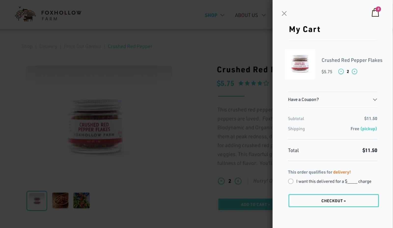
Along the path of purchase, we continued to use the color system to differentiate between service types.
Overall, we were able to combine two separate e-commerce platforms into one branded shopping experience. Design/UX helped delineate between the two service options, while content strategy and adjustments to user flows helped the overall site experience feel cohesive and natural.
Results
First off, managing one website has been a lot easier than managing two, both for us as webmasters and for Foxhollow Farm’s team as end-users of the new system. Sometimes two heads ARE NOT better than one.
As for the user experience and ultimately sales? Well, it looks like we hit our mark! Since the launch of the new website experience and combined eCommerce platforms, the eCommerce conversion rate for the new website more than doubled (+164%) the combined eCommerce conversion rate for the two separate websites in 2020!
However, it appears as though we did not just solve our management issues associated with multiple web properties but created a better user experience for Foxhollow Farm’s customers. Ultimately, they are the real winners!