Raise a glass, VIA is 21
By:
Corinne Resch
on 8/11/2017
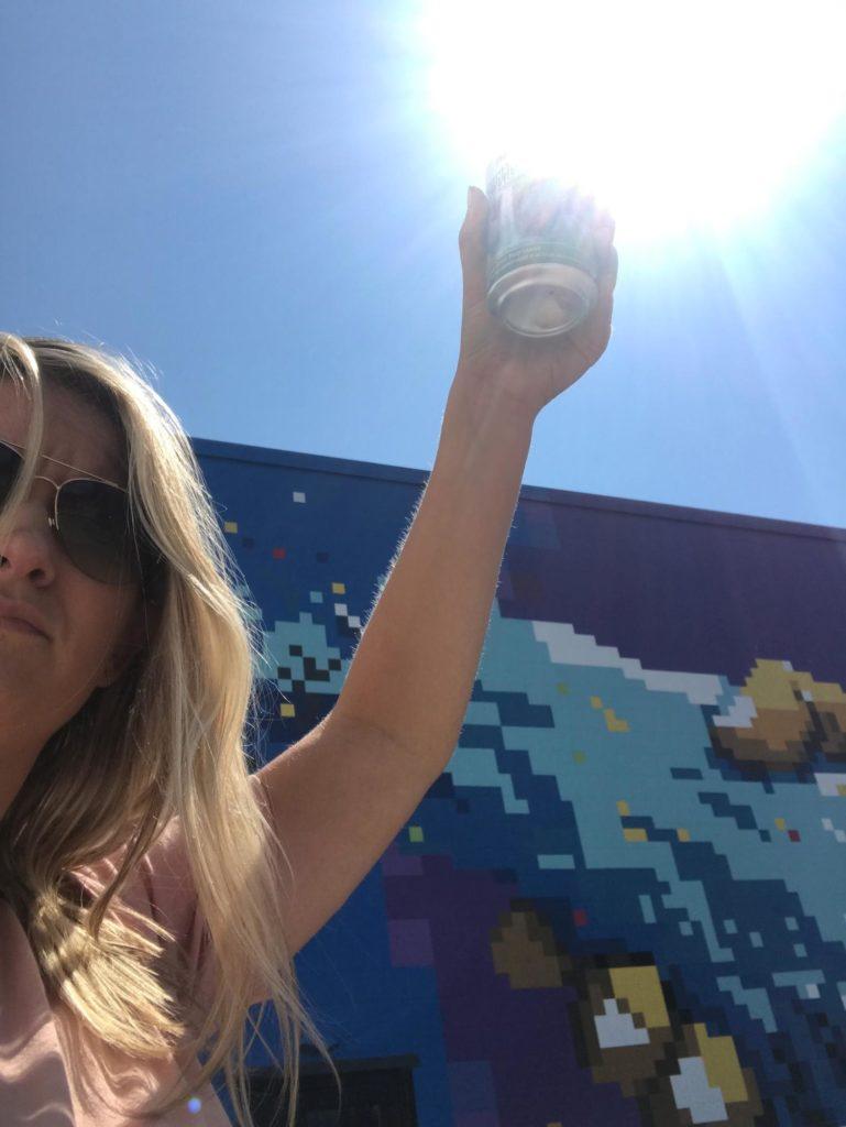
After a grueling week of sitting at our desks, the VIA Studio team often takes a Friday field trip up to the Louisville Beer Store. Here are some reviews of the cans we snagged this time around.
Bell’s Quinannan Falls – India Style Pale Lager
Reviewed by: Emilee Dover
Can Design: I love waterfalls and mountains and manipulating typography to stack as a unit, so I was drawn to this design immediately. It’s simple and without fuss of any kind, which I think fits perfectly in this regard. I am also a fan of the tone of the copy on the bottom “born in a dream⦔
Tasting Review: This little green gem tastes like grass, of which I am A FAN. It cascades with a finish of… aluminum. It honestly tastes like a hoppy PBR to me. But I don’t dock points for that. 7 out of 3 stars. Would bloat myself with it again.
Eviltwin Brewing – Unstouttd
Reviewed by: Morgan Plappert
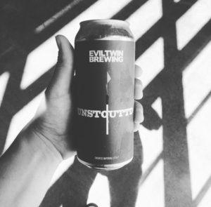
Can Design: It’s very Eviltwin-esque. Super minimalistic. Capitalizes on the simplicity and doesn’t try to over-do it. 5/10 unicorns
Tasting Review: Smoke is super strong, a little thin for the 10% ABV but hides that percentage insanely well. Taste is a little one-dimensional with the smoke taking over. Roasted/dark chocolate malts to back it up. Honestly, it tastes almost exactly like their “Christmas Eve At A New York City Hotel Room” beer.7.5/10 unicorns
Eviltwin Brewing – Pink Lemonade IPA
Reviewed by: Corinne Resch
Can Design: A prominent feature of this design is a generic white dude looking at you no matter how you turn the beer, a la Uncle Sam. The image itself looks like it was edited using Picnik (RIP) and maybe that’s what I like about it. Overall, I love that it’s hot pink and I can look past feeling judged for drinking pink lemonade beer by an anonymous dude on the can. 6/10
Tasting Review: This IPA with lemon and raspberry added is pretty spot-on when it comes to a summer beer. I like this beer because it’s light and refreshing but still has some hops. It really has the right blend of sweet, but not too sweet. TBH I ain’t that fancy or picky when it comes to beer, as long as it’s not a sour or a cider I’ll drink itâ¦.jk I’ll probably drink those too. 9/10

Against the Grain – Night Visions Radio Kolsch
Reviewed by: Mark Biek
Can Design: Cyberpunk when the idea of cyberpunk was still cool. The kind of can you’d pack into Chiba City with your console. Covered in psychedelic circuit-board eyeballs, I am reminded of the nights I came home to find my Freshman-year roommate sitting motionless in front of our strobe light. The cybernetic look-and-feel evokes more a sense of sehnsucht than plain nostalgia. I look at this can and I hear the modem noises that still haunt my dreams.

Tasting Review: The taste didn’t challenge or change me, but it was perfect for something cold while standing in a sunny spot in the kitchen. A good choice for when you don’t want to be too adventurous but you want something better than an “American Lager”. Sweet and crisp with a slight bitter aftertaste, like when the girl you like doesn’t notice your cool new shirt. Bonus points for the can being a full pint.
Rating: 111 / 1010
Evil Twin Brewing – Sour Bikini
Reviewed by: Natalie Miller
Can Design: I like what they did with the triangles looking like an abstract bikini, but I have to say I was OFFENDED by the note on the side that said it isn’t a ”sissy beer.” Like, what? Because it has the word “bikini” in it it’s a sissy beer? No. Go die in a hole.
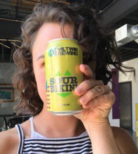
Other than that I didn’t think the colors worked too well together and the spacing was weird. 3/10
Tasting Review: Despite my objections to the can design the beer itself wasn’t bad. Its light and refreshing, and pleasantly sour without being overwhelmingly so. If you’re looking for any sweetness in your sour beer though, you won’t find it here. As an aside, it’s only 3% alcohol so what’s the friggin point? Obviously I need to read the can next time before I purchase. 6/10
Mikkeller Beer – Geek Breakfast
Reviewed by: Joel Jacob
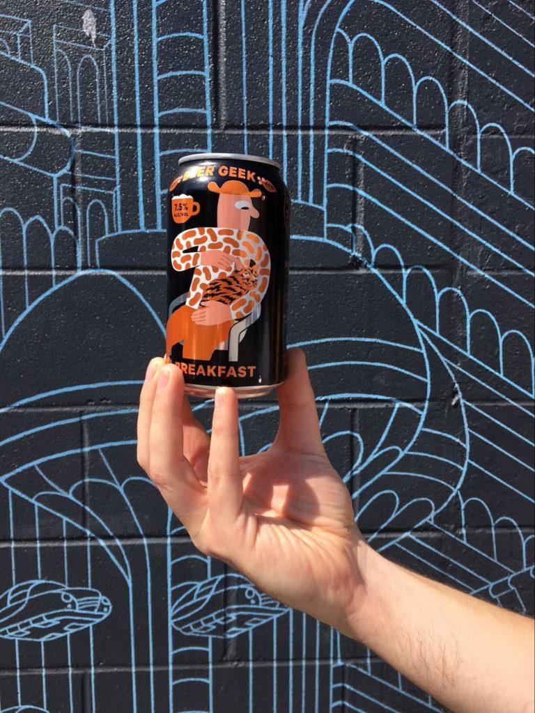
Can Design: Unmistakably Mikkeller. Love the Cheetos ® shirt.
Tasting Review: Very dark, almost black color. Aromas of coffee, roasted malt and slight smokiness. Taste is chocolate, light sweetness but it’s completely overpowered by coffee bitterness. Rating: 4 VIA unicorns
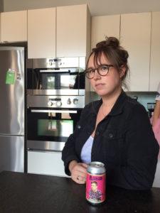
Central State – Garden
Reviewed by: Kelly Scheurich
Can Design: Sunny, simple, and all of the information is compact so you don’t have to waste your time searching for the ever important ALC/VOL which tends to be a decider half the time. This one is only 3.6% so I messed up. There are a set of these (with differing colors) and make for a really pretty shelf display. 5/10
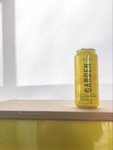
Tasting Review: Sour, lemony, good for summer. I don’t know anything about beer. It’s drinkable. 6/10
Mikkeller – Hallo Ich Bin Berliner Weisse
Reviewed by: Ann Wood
Can Design: I like raspberries, so the super obvious grid of raspberries definitely drew me in. Its simplicity can definitely be seen from across the room, which is helpful for brand equity. The grid of raspberries is definitely not the most original design they could have come up with, but I can’t be too judgmental, because I just really needed a tall beer today and this was one of the selections.
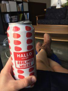
Tasting Review: It’s definitely more of a sour ale with a little bite at the end. It’s refreshing and fruity, which is what I love. 8/10 would recommend.
Michelob – Ultra
Reviewed by: Pat Sheehan
Can Design: I’m not skinny. I’d like to be skinny but no matter how many of these skinny cans of beer I drink I’m still the size of North Dakota. So the skinny beer can that I really like is truly a design misnomer. (Other than it does fit nicely inside your sport coat pocket at a wedding.) And it’s blue. I like blue things. Beer cans, t-shirts, whales. So if it’s blue and skinny I like it.

Tasting Review: It’s a light pilsner designed for people who like skinny things and the color blue. In fact if you ate the beer carton you’ll probably get more flavor out of the cardboard than this liquid called Michelob ULTRA. 5/10 recommend.
HAPPY 21 VIA!

Related Posts

CNPE's Destination:Excellence 2018
By:Jason Clark on 5/23/2018
The Center for Nonprofit Excellence (CNPE) is an organization that helps nonprofit leaders and organizations become the best version of themselves, through consultation, events, and other professional development activities. Last Friday, May 18, we were honored to host the Center for Nonprofit Excellence Destination:Excellence 2018 class for a day of learning.
Read More »
Mike Monteiro - May 16 & 17 at VIA Studio
By:Jason Clark on 3/8/2019
VIA Studio is proud to host two events in May featuring renowned design heavyweight Mike Monteiro! Mike is the co-founder and design director of Mule Design. He prefers that designers have strong spines.
Read More »