Typography in Design

Most people know that typography is an essential part of design; but why? Type can convey emotion, professionalism, and even the trustworthiness of the brand. Because of this, we must be very mindful of which typeface we choose to best suit the design. With this comes treatment. Creating hierarchy and knowing when to choose a bolder type will let the readers know what they should pay attention to. Here are some important things to consider when designing with typography:
Important Thing No. 1
Medium
Typography, like paint or clay, is a medium. This medium allows you to convey messages not only through written language, but also through the type’s personality.The addition of color takes this medium to another level. We know that colors have their own personality and psychological effects, so we must be cognizant of both type and color and how they work with one another.
When working with multiple fonts in a design, we must treat them as puzzle pieces. They’re not necessarily the same, but they need to fit together to work. Each font brings something different to the table that is a necessary part of the design. Here are a few guidelines to follow when pairing multiple fonts.
Important Thing No. 2
Mood
Each website, advertisement, heavy metal band t-shirt, bank statement, etc. has its own mood, personality, and voice. A main way of communicating those (along with color and imagery) is through typography. For example, a metal band will tend to stray away from a frilly script font. Script gives the feel of elegance, formality, with a hint of whimsy. Not the typical mood of metal.
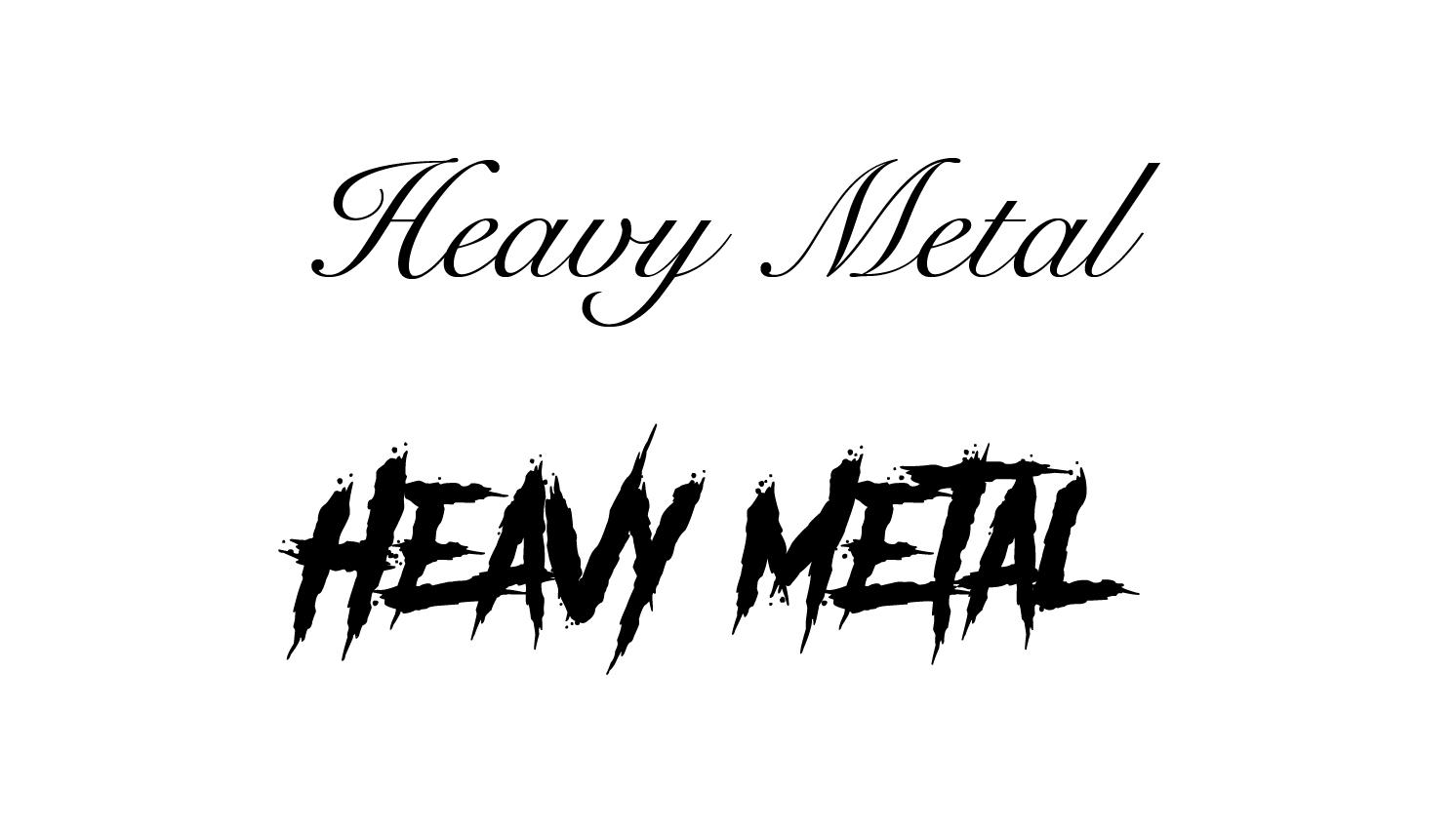
If I’m designing a t-shirt for said band, I’m more likely to go with a bold, slab font or a pointy, rugged display font. These fonts are in-your-face, loud, and edgy to mimic the band’s sound. For whatever design you’re creating, there’s a font (or ten) that will suit the mood. To start your journey, there are four main type styles to explore.
Serif
Serifs are arguably the most widely-used type style. They are categorized by their little marks on the edges of the letters. Serifs are formal, traditional, and give a classic feel to the content. They are best used as headings on a website or body copy in print.

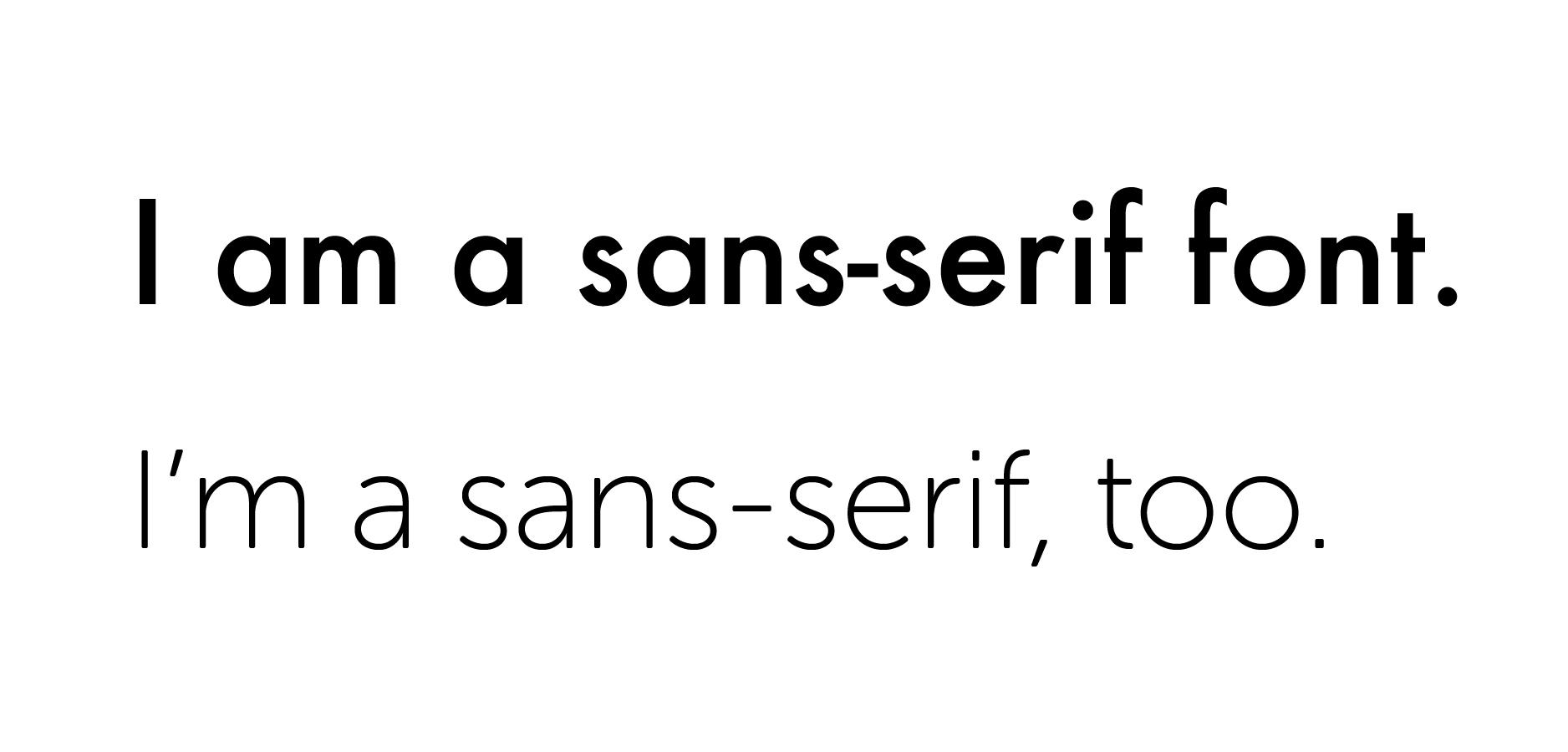
Sans-Serif
Sans-serif literally means “without serif”. These typefaces are minimal, clean, and modern. They’re very versatile and best for web-use as either a heading or body copy. However, you won’t find a sans-serif often used in the body copy of printed text.
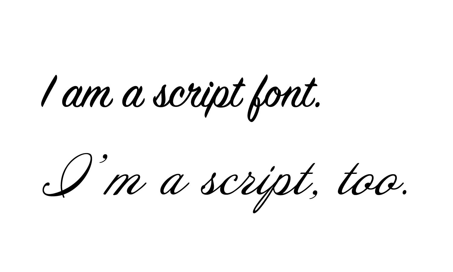
Script
Script fonts are either in cursive or appear to be handwritten. Depending on the style, these typefaces can either be playful and casual or formal and elegant. Often used as a header or in short-form like a wedding invitation, these fonts should not be used as body copy because they can be quite difficult to read.
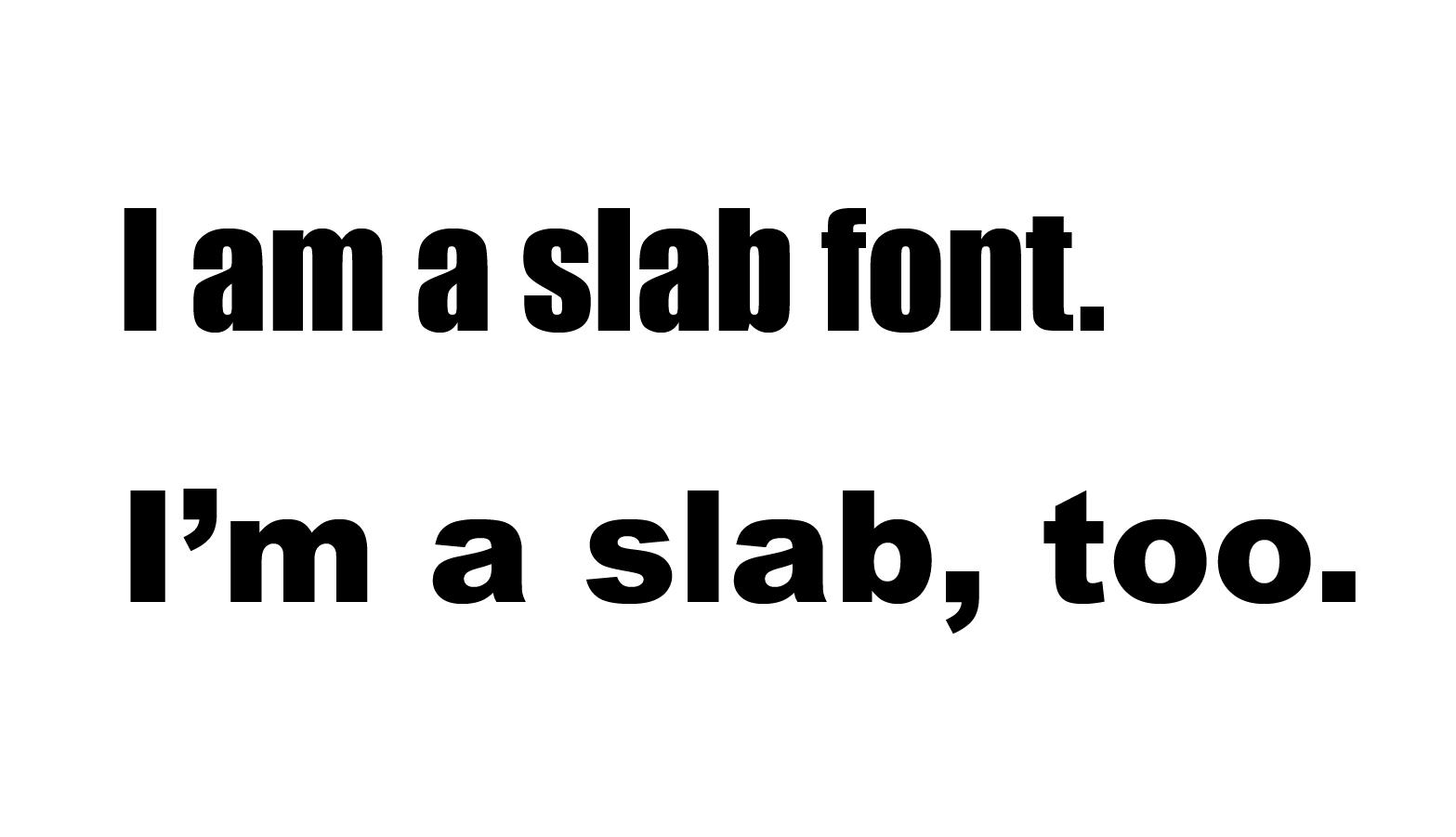
Slab
Slabs are characterized by their thick strokes. These bold fonts add visual weight, grab attention, and often “yell” at the reader. Often reserved for headings and short-form like a flyer or advertisement.
Important Thing No. 3
Organization
Organizing the layout of a page is imperative to good design and ensuring viewers will read through your page. Have you ever gone to a website where this is happening?
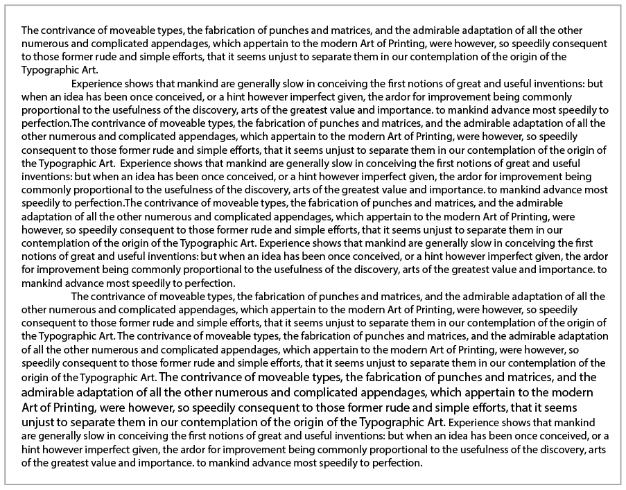
Yeesh!
The standard for comfortable reading is between 45-75 characters per line (both letters and spaces). Our eyes (and brain) get tired very easily, so we need to help them out. We do this with hierarchy, smaller blocks of text, and breathing room. This example provides us with no headings for hierarchy, long blocks of text, and no spacing between paragraphs. Resulting in an overwhelmed reader who probably won’t finish the article. If you’ve put much of your time and effort into designing something, you want the reader to be interested and not glance at it for a millisecond and move on.
Important Thing No. 4
Attention
Attention is best kept when a reader experiences effective hierarchy in a design. Hierarchy is created through type scale, placement, color, and/or style. This signals the importance of the message while also leaving you an “information scent”. Quickly and easily, the reader knows what the content is about and if they are interested in delving in further. This saves time for the reader, which we all know is precious.
Jakob Nielsen speaks of information foraging
“Humans are informavores. On the Internet, we hunt for facts. In earlier days, when switching between sites was time-consuming, we tended to stay in one place and dig. Now we assess a site quickly, looking for an “information scent.” We move on if there doesn’t seem to be any food around.”
Aaaaaaahhhh⦠Such hierarchy.
As designers, we want to give our readers plenty of (delicious) food to visually ingest. They aren’t able to visually eat this food if the organization is whack and the typefaces are overwhelming or confusing. We want our readers to experience joy when viewing our design and leave feeling satisfied and informed.
Related Posts
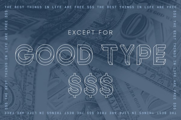
The best things in life are free… Except for good type.
By: Mitch Wiesen on 5/17/2021
Why you should budget for typefaces in your next creative project.
Read More »
How to Make Your New Photos Look Vintage
By: Mitch Wiesen on 9/1/2020
I’ve always been drawn to the warm, friendly way film captures reality. I found my first analog camera, a Canon AE-1, sitting on a blanket at a flea market at age 14, and I was enamored.
Read More »