Raise Your Flag!

Flags were one of the first ever forms of graphic design. Their initial purpose was to identify ships at sea – think Pirates of the Caribbean. As they became more recognizable and widely used however, they evolved into representations of military units, then governments and countries after that.
So, What Makes a Good Flag, Good?
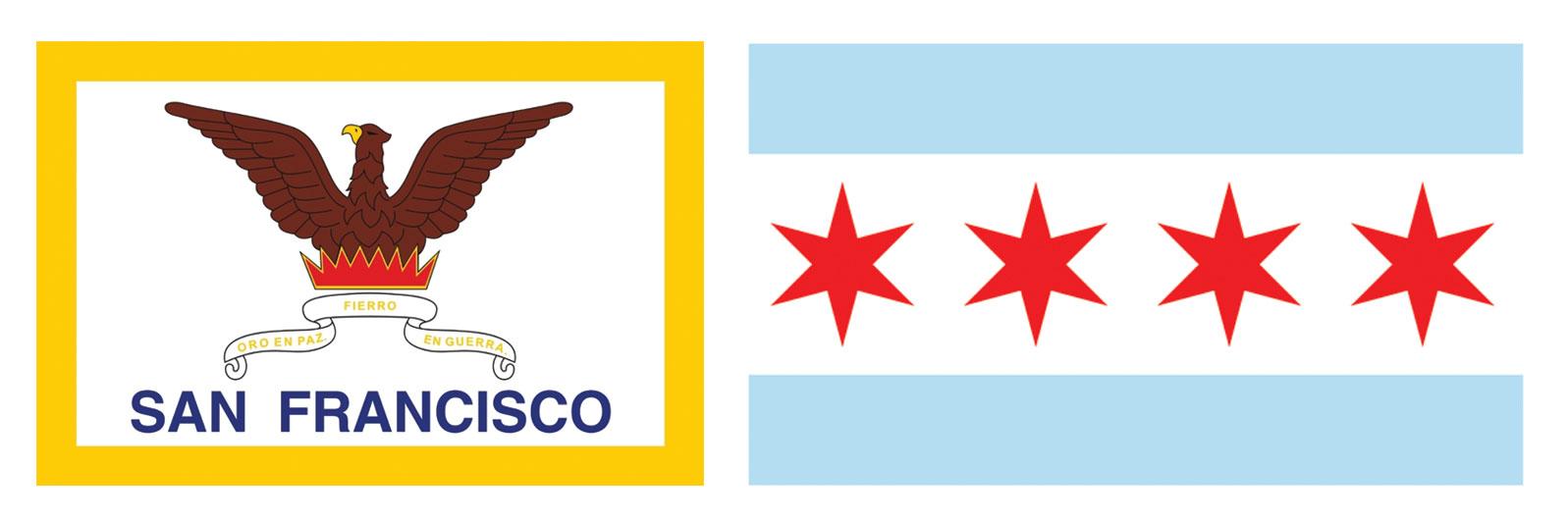
Iconography of a flag serves to promote unity and awareness. Roman Mars of the podcast 99% Invisible has an outstanding TED talk on city flag design where he highlights the brilliance of the Chicago Flag and the San Francisco Flag’s unpleasantness. According to Ted Kaye, a renowned Vexillologist and author of the mini-book on flag design Good Flag, Bad Flag there are five basic principals of flag design:
- Keep it simple: a child should be able to draw it from memory
- Use meaningful symbolism: colors and imagery should have an underlying meaning
- Use 2-3 basic colors: from a standard color set
- No lettering or seals: no written words [surprise!]
- Be distinctive or be related: an original creation or one that resembles the flag of the country’s origins to display a connection
Bad Good
So, How’s Louisville Doing?
It’d be hard to talk about flag design without mentioning our own city, right? Louisville hit the ground running with its first flag design. Following all of the basic rules we listed above, the original paid tribute to Louis XVI of France by depicting 3 fleur de lis, as well as representing the thirteen states that were present at the time the city was founded by using simple symbolism of thirteen stars. Louisville has since revisited the original design and decided to change the flag in 2003 when Jefferson County merged with the city.
The result? Meh, Not bad … But, how cool is that old flag though?
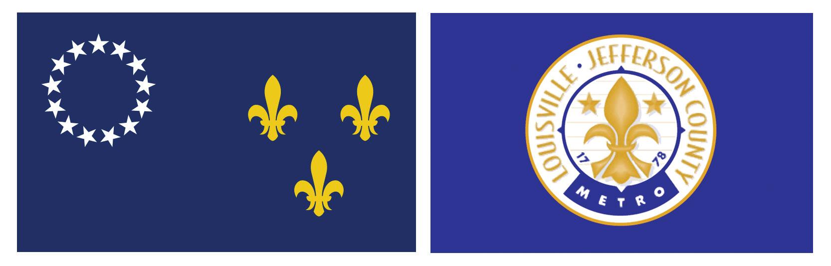
Before After
New Zealand’s Contest
In the design world, pro-bono logo contests are usually met with a frown. They’re basically considered another way of someone asking ”Can you make us a logo, for free?” but New Zealand’s recent decision to put their new flag design in the hands of the public in their flag consideration project caught our attention. A contest to redesign a Nation’s flag. A chance to create a piece of lasting history through design … I mean, c’mon. That’s pretty cool.
For the New Zealand contest 10,292 flag designs were entered. From those submissions four emerged as top alternatives to the current flag. The contest will conclude with two public referendums in late 2015 and early 2016 where citizens have an opportunity to vote on maintaining the current flag or opting for the final flag from the contest chosen by a panel.
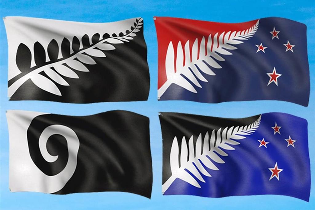
The Final 4
Contest guidelines of the New Zealand project also articulate a few other points to keep in mind when designing a flag:
- The design should be simple, uncluttered and balanced.
- It should look as “timeless” as possible.
- In terms of color, using fewer colors will keep the design simple and bold.
- Contrast is important â use light colors on dark, and vice-versa
Designing a flag recalls a lot of the same issues and problems faced when designing a logo – representing a brand through a mark. Symbolism of a flag or a logo can help form a connection with your audience. Good design will help to establish trust and resonance. While bad design … Well, bad design will evoke whatever it is you felt when you saw San Fransisco’s flag above.
The Final Test
So, based on the knowledge we have given you, do you feel like you could go out there and knock your own flag design out of the park? Let’s pump those brakes for a second and put that newly found knowledge to the test. Take the test below and see how many good flags you can identify out of the bunch. When you’re done (no peeking), refer to the answer key below for explanations why each flag is considered to be good, or bad.
Ready, Set, Go!
(We said no cheating!)
Answer Key: Virginia Bad: Too many colors. 18 to be exact. Flags should typically stay between 2-4 colors to remain scalable and affordable for manufacturing. Dominica Bad: Similiar to Virginia, Dominica’s flag contains too many colors. Too complex and too much detail. New Mexico Good: The symbol has meaning dating back to New Mexico’s Native roots. The colors tie back to Spanish heritage. Navajo Bad: An example of how not to display symbolism. Way too much going on, with over 20 different elements. Ukraine Good: The colors represent the sky hovering over the wheat fields. The colors tie into that very same same meaning. Simple, symbolic and effective. Congo Good: Easily recognized when reversed. Colors create contrast and stand out from one another. Milwaukee Bad:Again, too many elements and way too chaotic. Libya Bad: This is an example of over simplifying. The green, when seen in black and white will appear as a gray block. Does not represent the country effectively.
Related Posts
Where Do We Start? The Technical Audit
By: Kim Clark on 3/15/2010
Any solid SEO program should begin with at technical audit of your website.
Read More »
VIA Studio Joins Google Apps Authorized Reseller Program
By:Jason Clark on 3/25/2010
VIA Studio today announced it has become an authorized reseller of the Google Apps suite of communication and collaboration tools. VIA Studio provides setup, integration & support services for businesses and organizations using Google Apps.
Read More »