Nonsense in Form Design

As a geek, I’m extremely fond of trying out new apps and purchasing weird stuff online.
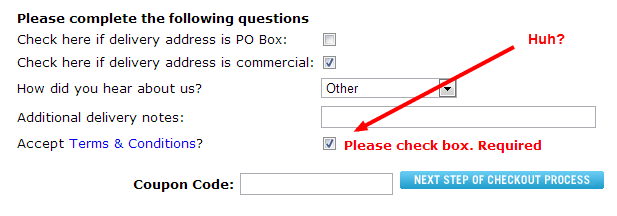
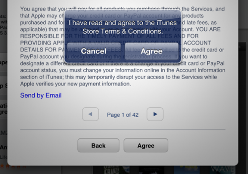
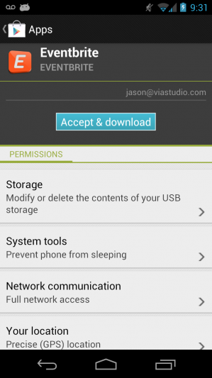
More and more I’m confused and annoyed by the process of clicking things that I have no choice but to click. Most of the time it’s designed so badly that if I were a little less tech-savvy I probably wouldn’t even know what I was clicking. As a company that develops ecommerce solutions, I’m aware of and respect the necessity of Terms & Conditions, but that doesn’t mean you need to add another layer of confusion on top of what can be an already frustrating process for a large segment of the population.
Let’s take a look at some good and bad examples of this type of web design. As you’ll see, it’s not just ecommerce, it’s common sense in all form design.
BAD, BAD BAD Examples:
GOOD JOB, People:
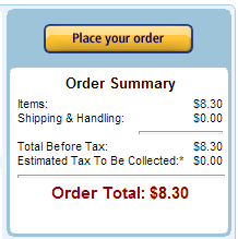
Amazon had completely taken this acceptance out of their purchasing options. It’s inherent in the process that you accept their conditions.
Beautiful. No need to check any boxes.
Has anyone else seen extremely bad examples of this nonsense?
Related Posts
4 AI Resources To Add To Your UX Design Toolbox
By:Morgan Plappert on 7/18/2023
These AI-powered tools can help you streamline your workflow and empower you to take your designs to the next level.
Read More »
Wireframing vs. Prototyping and Everything In-Between
By:Morgan Plappert on 7/14/2020
Prototyping demonstrates ideas, and baking prototyping into your workflow can begin to shift the way you think and approach design problems as a whole.
Read More »