Creating a Design System in Figma

Introduction to Design Systems
When talking about something complex, I’m a big fan of using relatable metaphors. In this instance, I’ll pull from art at its most basic level.
Everyone has taken a stab at filling a blank page or canvas with something, right? A pencil sketch in a notebook or a coloring page where you filled in shapes. Web design, like art, has countless mediums, layers to expression, and varying levels of complexities. So, what’s the equivalent of a beginner wanting to learn to draw by following a tutorial and sketching a simple still-life in a notebook? Probably Wix or Squarespace using a basic template. And that’s totally fine. It gets the job done. But: hundreds, if not thousands have followed that same tutorial and drawn that same still-life, just like thousands of others have used that same template.
What’s a much more complex expression? Having a full team — designer, developer, account manager, content strategist, etc and starting with a blank project in Figma. It’s a different beast. Just as an artist stares at a blank canvas on their easel. You haven’t created anything yet, but you have every resource imaginable at your disposal. You get to create the rules. You’re not coloring within the lines because you are the one creating the lines.
Intimidating? Maybe. Rewarding? Hell yeah.
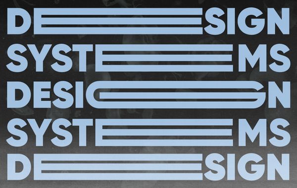
Enough of the Romanticism. What is a Design System?
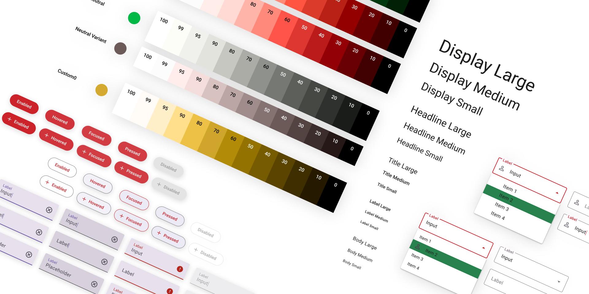
Example of an open source, Figma Community Design System
A set of rules and guidelines that act as a single source of truth for digital interpretation of your brand. A design system is essentially a complex digital brand guide. The building blocks for any web work.
The Layers (No Pun Intended) of a Design System
I can’t break this down any better than Brad Frost did in his “Atomic Design” explanation of a design system.
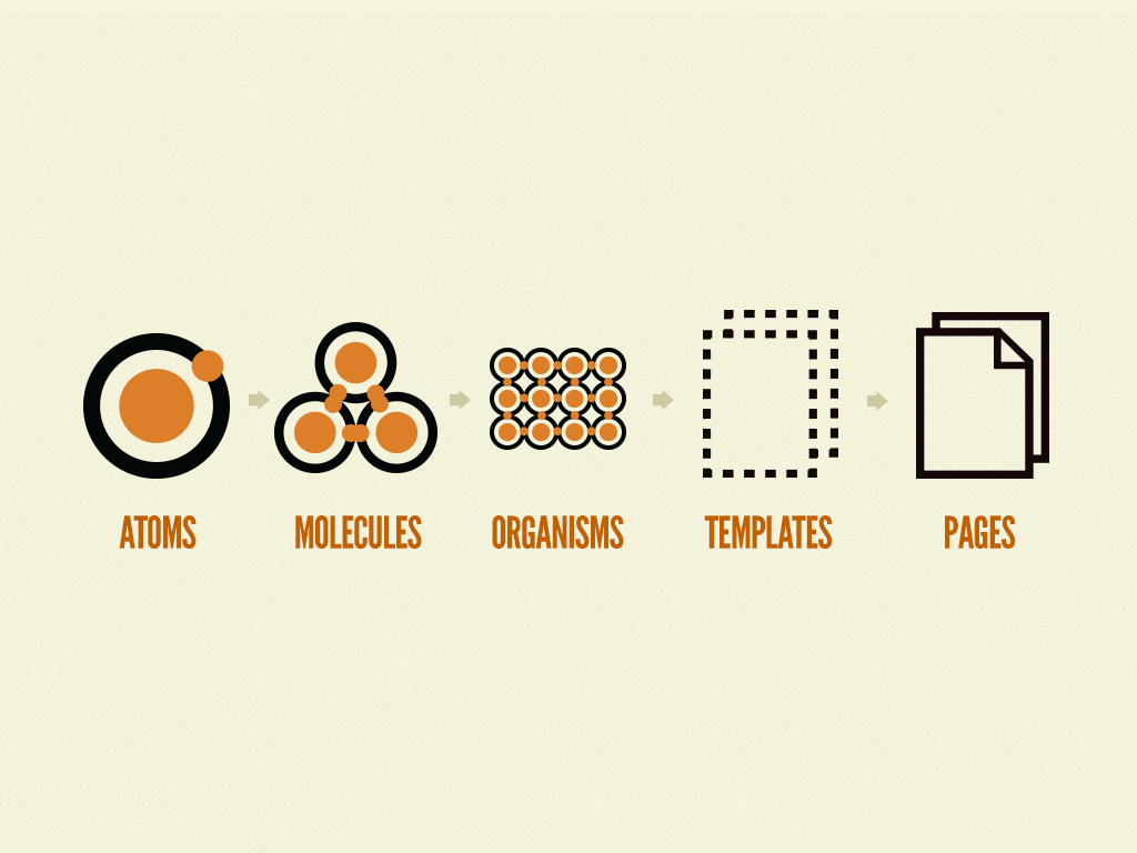
Source: Brad Frost’s Atomic Design Methodologies, Chapter 2 on Atoms, Molecules, Organisms, Templates & Pages
- Atoms represent base-level, foundational elements of your design system. Things like the brand’s logo, color palette, and typography.
- Molecules are basic rules and standards around combinations of atoms. Think of a color assigned to a specific header style. Or a border-radius applied to all shapes/masks.
- Organisms are combinations of atoms and molecules that come together to build more complex clusters. Essentially organisms = components.
- Templates and pages are then pieced together using your collection of organisms.
- The brand you are working with is your design language. The brand guidelines are your dictionary no matter the medium - From a t-shirt design to your brand’s website. It should all follow the same language.
- Design tokens within your system are your foundations - Color, typography, specifications like spacing, border radiuses, effects such as drop shadows, iconography, illustration, etc.
- Your UI or core elements should be things like buttons, link styles, radio buttons, toggles, form fields, etc.
- Your components are when all of the above come together. UI elements are used with foundational tokens, which are combined using specific standards of implementation that create a cohesive, flexible, and scalable system with infinite potential.
Benefits of a Design System
Ok. That was a lot to digest. What does this mean for you? For your team? For your clients?
1. Better interdisciplinary collaboration
To create a design system, specifically in Figma, is to bring together teams and form a shared language. For example, designing on a component level gives designers a single source of truth to extend across multiple pages, creating consistency and holding yourself accountable. It also gives developers 1 “thing” to build, with rules and guidelines around it so that work isn’t being duplicated.
All components and tokens are stored globally, so instead of varying fills and hex codes floating around, you are applying singular, global styles. Everything is centralized. You have your puzzle pieces at your disposal and so does dev. Likewise, say you bring a new designer onto the team or introduce a new account manager to the project. There is a centralized repository for knowledge sharing with other designers, PMs, AMs, developers, and even the client.
2. Scalability
You have rules to follow! Want to add a component to a system? Need a new feature? Throw away the bandaids, your design system is here to help.
Scaling design, adding features, and having another designer work on a project they’re unfamiliar with. These are all things that run the risk of misalignment, accidentally introducing new styles and patterns, slight variations, and inconsistencies creating a mess in both design and code quality. But if you have a system, you create a consistent design language to be followed.
Components become a reflection of these standards. And any future addition of components follows the same guidelines to ensure consistency. For design, this means applying styles and working from your core bank of tokens and components. For development, this means not having to make code decisions. Decisions are made by pulling from a centralized bank of rules that hold design and dev accountable and create reliable user experiences.
3. Flexibility
Starting with a core set of principles to then build more complex components allows you to create changes globally without having to go back and do a ton of rework. If you are using your building blocks to construct pages, you then have a much simpler way to maintain your designs and thus, the flexibility to make changes. Go to your design token and update the style, that change is then applied across the board on all pages. Go to a global component and reorder content or change the background color. Again, global application, not a singular instance change. Using a combination of tokens and components means consistency, it means saving time and it means updating or making changes becomes a million times easier.
4. Efficiency
With a component-level approach to design and implementation, page building becomes easy. You are grabbing puzzle pieces to build out new pages, combining building blocks to enable a modular, flexible system. Likewise, developers can spend less time tediously coding out section by section of pages or adding unique features. You have a cross-departmental system that houses a single source of truth for all past, present, and future iterations of product design and development.
5. I’m a UX designer, so I have to sneak this one in. But it’s true. Having a design system improves a website’s user experience.
My goal as a designer is to spend more time-solving high-level problems and less time being consumed by busy work and pixel pushing. Figma and a component-level approach to design help me accomplish both of these. Strategy and UX collaboration work are done upfront. You solve the most complex issues and answer complicated user questions at the beginning of the project to inform the remaining work. This becomes your guiding star for building out a design system. It gives you the parameters to build a successful system that focuses on who it is serving. A good design system creates a great user experience because it feels authentic, consistent, and trustworthy.
So, What Does This Have to Do With Figma?
Great question. To which I respond EVERYTHING. I get made fun of for being such a Figma fan but I can’t help it.

Yes, Clark. Yes, I would.
When I started in Sketch, I immediately fell in love. It was the first design software that told me web design was what I wanted to be doing. I could create vectors like in Illustrator but I could focus solely on digital and UI implementation without print-based features crowding the interface. I continued to use Sketch and XD in tandem for a few years before building up the courage to convert fully to Figma. And there was no going back.
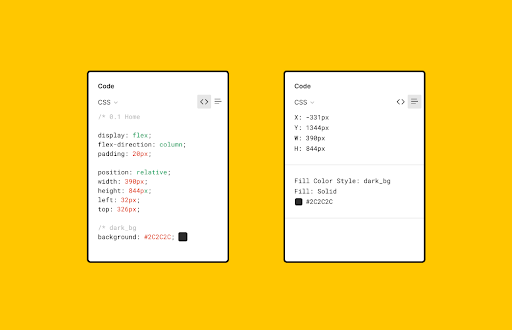
What makes Figma great is collaboration. Figma was built with collaboration in mind. You can have multiple people working on the same file at the same time, it has version history so you can always reference past iterations, you can hop on a call while in the app with another contributor, or leave comments directly on designs with the chat functionality, it’s browser-based so you don’t even need to download software or have an app. I can share links to designs and/or prototypes with project managers to bring up during a presentation, or open access to clients to leave comments directly in the file. I can share a Figma link with a developer who has viewing permissions and they can comment, export assets and even “inspect” to pull CSS code directly from the designs. The list goes on.
Figma is THE tool for creating design systems for all of the reasons that design systems are so great. It comes full circle.
It offers better collaboration, it’s easier to scale designs, things like auto-layout create massive efficiencies between disciplines and the UX of the platform itself is top-notch. There’s a community of resources and plugins, open-source design files to be shared, team collaboration templates through Figjam and so much more.
This is a lot of Unicorn and Rainbow Talk. What's the Catch?
Figma has a pretty steep learning curve. It can be intimidating to start in because there is just so much to learn. You have to put in the time in order to grasp some of the more complex nuances and advantages that it has to offer. That being said, it’s pretty easy to learn the basics and Figma offers a ton of learning resources for beginners.
I’d say the things that take the most time are learning to control components, using auto-layout, mastering prototyping capabilities, and building a repository of go-to plugins. But that’s life, right? It takes time to get comfortable with something and Figma offers enough right off the bat to be dangerous.
Does a Design System Limit Creativity?
This is something that I try to be conscious of every time I set out to design a website or create a design system. Creating a design system offers a framework and set of rules to create alignment and manage consistency at scale. This is all great, just as long as it’s not at the expense of creativity and innovation. The age old form / function argument. Craft and creativity should not take a back seat to efficiency. Create principles and guidelines that inspire and guide. Use these to influence further exploration, experimentation, and creativity. Be consistently creative and fun. Bend the rules without breaking them.
Creating a base set of rules doesn’t have to be boring. Be happy with a kickass solution and then use that as your status quo. Go back to the benefits of a design system — scalability and flexibility. If you need a new component don’t try to force a circle into a square. Design a new component! Define its purpose and add it to the system. It becomes another piece of your puzzle. Pull in some fun micro interactions. Build animation and movement into your system to inject life and personality. Rules don’t have to = boring product. It’s something I push myself to be better at every day.
“A system defines solutions. YOUR solutions define the system.”
Feel free to reach out to our team at VIA for any questions or inquiries about creating a design system for YOUR brand. We have a few fun design system-based projects that will be launching in the very near future. Stay tuned!
Related Posts
4 AI Resources To Add To Your UX Design Toolbox
By:Morgan Plappert on 7/18/2023
These AI-powered tools can help you streamline your workflow and empower you to take your designs to the next level.
Read More »
Wireframing vs. Prototyping and Everything In-Between
By:Morgan Plappert on 7/14/2020
Prototyping demonstrates ideas, and baking prototyping into your workflow can begin to shift the way you think and approach design problems as a whole.
Read More »