Elements of Logo Design

The recent Google rebrand got us thinking about the importance of speaking to your audience through logo design. The first conversation between someone and your brand is an important one, and your logo is what speaks the loudest.
Make it stand out. Tell a story.
Starbucks, number 45 on Forbes list of most innovative companies, was founded in 1971. In 2011 Starbucks made a bold move to evolve their brand to coincide with the 40th anniversary of their siren logo. As CEO Howard Schultz explains it embraces their heritage and displays an evolution toward the future expressing the love they have of their coffee and the connection they have with their customers.
So what goes into overhaul designs like Google and Starbucks? Let’s take a look at some of the design principles that must be considered in a logo revamp.
Typography
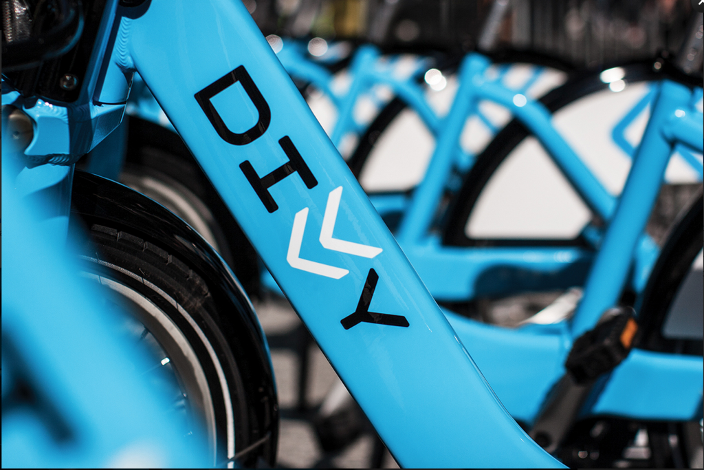
Typography can make or break a logo. It’s important to pick a typeface that coheres to the brand and that blends well with the mark. Divvy is a good example. A Chicago urban bike sharing service, aimed at making bicycling a practical, painless, and convenient mode of transporting around the city. IDEO Chicago and Firebelly partnered to develop the brand.
The logo edges have a slightly rounded curved shape to express a smooth ride of the bicycle. Weights of each character and their rounded shape offer a utilitarian feel that connects to the city and can be comfortably positioned in its urban environment.
“The double Vs in the logo refer to the sharrows painted on bike lanes. It’s a nod to how the city prioritizes bike safety, paving the way for new riders.”
Shape
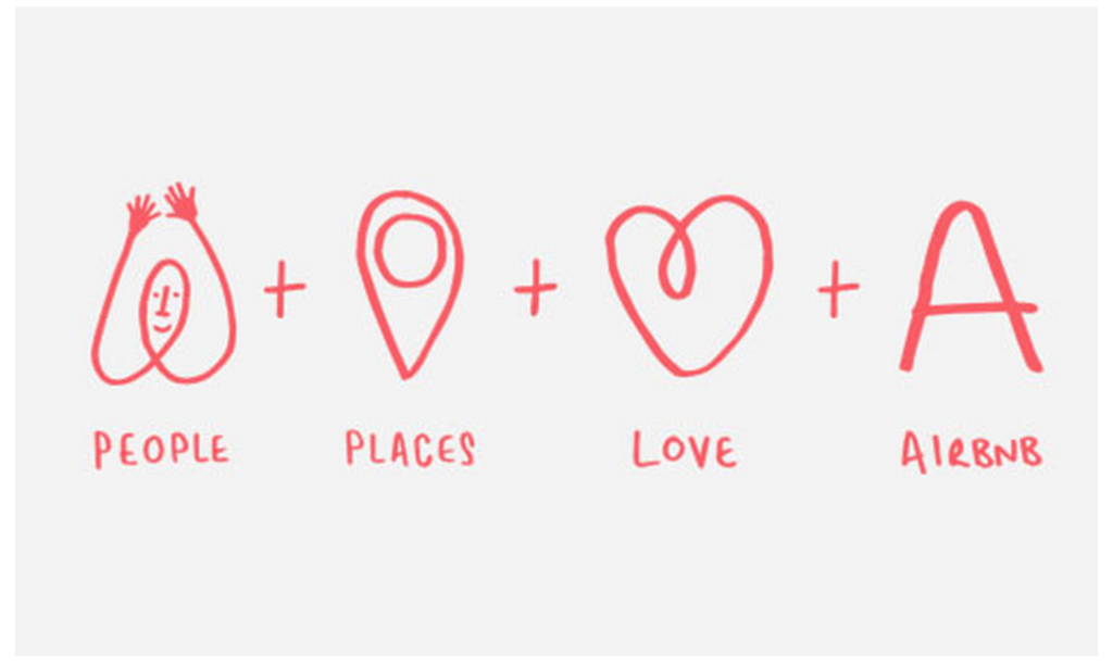
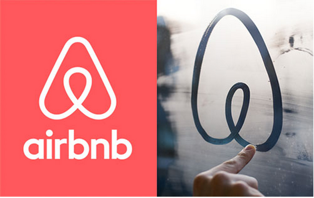
Shape is ever-so important to a mark. It has to live well in its space, be scalable, and capture the attention of the viewer, making it instantly memorable and recognizable. DesignStudio redid the the AirBnb logo and brand to align with the business and community. DesignStudio founder Paul Stafford talks to Airbnb CEO Brian Chesky about the rebrand in this interview. The icon created signified the idea “belong anywhere” to transcended language, culture, and geography.
photo credit: https://www.wearedesignstudio.com/works/airbnb-process/
Color
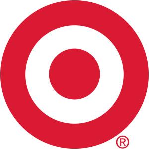
Ahh, color. What most people fail to realize, is that color actually subconsciously effects the viewer, targeting and eliciting certain emotions just by simply seeing it. Target’s red and white color scheme is a perfect example. It holds harmony from shape to color. Red symbolizes passion and white stands for nobility and elegance.
So, How Do You Use These Elements to Your Advantage?
To further explore how the elements of typography, shape and color are important to a logo, we decided roll up our sleeves and get our hands a little dirty. We positioned the name VIA around 3 very different, fictional companies (health care, a motorcycle shop and a flower shop) and created a mark for each. By doing this, it allowed us (and you) to see how the 3 elements we decided to focus on, change when their audiences or potential consumers are so very different. Behind the scenes, there is a lot that goes into the design of a logo. Every nook and cranny, every element you see is used to target something. Everything has a purpose (whether they know it or not).
Let us explain and help you visualize … Here are 3 “quick” examples we created: VIA’s – Flower Shop, Health Care and Motorcycle Shop. So, let’s go ahead and dive head first into the complex world of logo design and see why every little detail is so important.
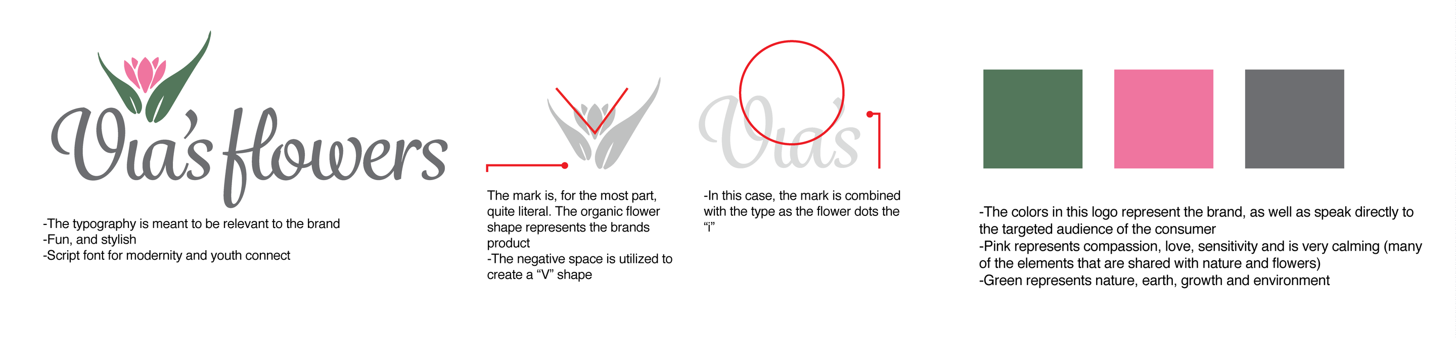
VIA’s Flower Shop
VIA’s Cycle Shop

VIA Health Care
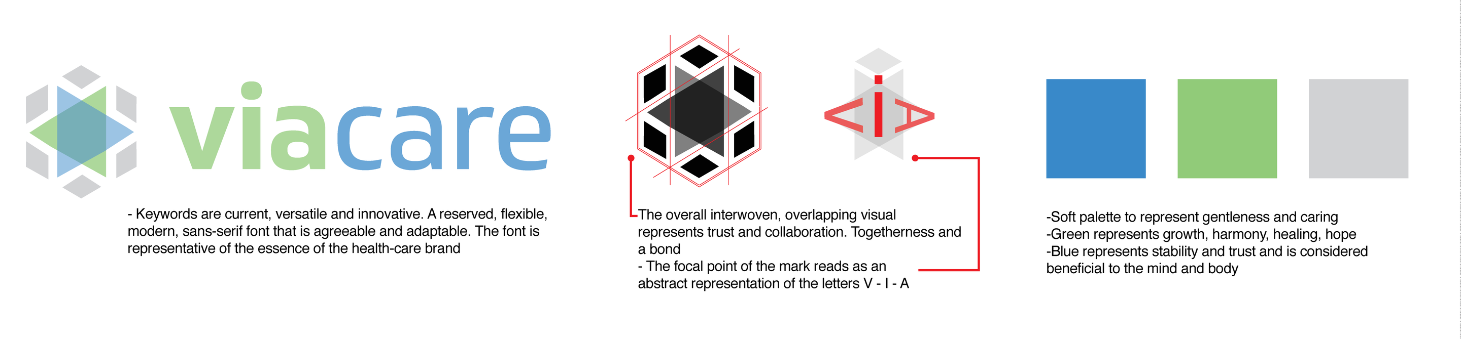
* Visuals created by Morgan Plappert
Three completely different brands, three completely different logos, and three completely different outcomes. Arriving at a final logo is more than creating a mark that looks pretty, it’s about solving a problem and creating the best possible solution. Typography, color and shape all play a huge role in this.
These three design principles are intrinsic to the visual identity of a logo. But beyond that, we must pay attention to the brand essence itself. Read about the process behind our Best of Louisville logo redesign and campaign for a good example of how a brand story is absolutely necessary to logo design thought. At VIA, we pride our work on bridging the gap between a user’s experience with the brand and the story the brand needs to tell.
*This post was a written collaboration between Casey LaRue and Morgan Plappert
Related Posts
Where Do We Start? The Technical Audit
By: Kim Clark on 3/15/2010
Any solid SEO program should begin with at technical audit of your website.
Read More »
VIA Studio Joins Google Apps Authorized Reseller Program
By:Jason Clark on 3/25/2010
VIA Studio today announced it has become an authorized reseller of the Google Apps suite of communication and collaboration tools. VIA Studio provides setup, integration & support services for businesses and organizations using Google Apps.
Read More »